
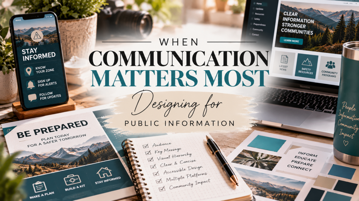
In public information, communication often has to do more than look good. It needs to be clear, accurate, timely, and easy to understand. Sometimes the person receiving the information may only give it a few seconds of attention, which means every word and design choice matters.
Working in public information has shaped the way I approach communication and design. Before creating a graphic, message, or campaign, I think about what the audience needs to know first. What information is most important? What can be simplified? What needs to stand out immediately?
Visual hierarchy plays an important role in answering those questions. Headlines, typography, spacing, color, photography, and placement can help guide someone through information in the order it should be understood. When too many elements compete for attention, even an important message can become difficult to follow.
Consistency is equally important. Using recognizable colors, fonts, logos, and other brand elements helps establish credibility and allows audiences to quickly identify where information is coming from. At the same time, the design has to support the message rather than overpower it.
Public information also requires flexibility. A message may need to work on social media, a website, a printed flyer, an email, or another platform. Each format presents different challenges, but the goal remains the same: communicate the most important information as clearly and effectively as possible.
That experience has influenced how I approach all creative work. Whether I am developing a public information graphic, creating an event piece, or building a visual campaign, I try to balance creativity with purpose.
Good communication should not make the audience work to understand the message. The design should help lead them to it.